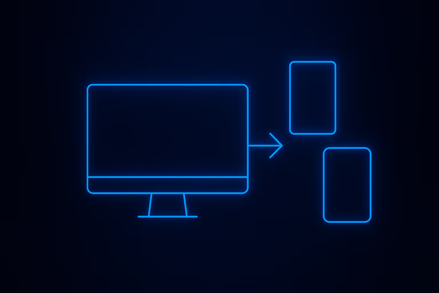
How to Make a Responsive Design in Webflow
- Better user experience (UX): Visitors stay longer when a site feels smooth and easy to use.
- Higher SEO ranking: Google rewards mobile-friendly pages.
- Increased conversions: A fluid design that adapts to any screen boosts trust and sales.
Cost efficiency: Instead of creating separate desktop and mobile websites, one responsive design works for all.
Modern best practice is to design for the smallest screen first. In Webflow, you can start with the default mobile view, then scale up.
Why it works:
- Forces you to keep the layout clean and focused.
- Ensures smooth scaling up to larger screens.
👉 In the Webflow Designer, choose the smallest breakpoint (mobile portrait) first. Build a simple layout and add essential elements. Then move up to tablet and desktop.
Breakpoints (точки перелому) let you adjust your layout for different screen sizes. Webflow gives you predefined breakpoints:
- Desktop
- Tablet
- Mobile landscape
- Mobile portrait
You can also add custom breakpoints if your audience uses specific screen widths (for example, large monitors).
Tips:
- Always design from the smallest breakpoint up.
- Avoid pixel-perfect positioning; use flexible widths and percentages.
Keep user experience (UX) consistent across all screens.
Fluid layouts allow your site to stretch or shrink smoothly. In Webflow, use:
- Flexbox for dynamic positioning.
- Grid for structured yet flexible layouts.
- Percentages, vw (viewport width), or em units instead of fixed pixels.
Example:Instead of setting an image to 400px, set it to 50% width so it adapts to the parent container.
While Webflow handles media queries automatically when you edit each breakpoint, you can also add custom CSS if needed.
In Webflow, just change the style on the desired breakpoint, and the platform creates the media queries behind the scenes.
A responsive web design isn’t only about layout. Large images can slow down your site on mobile.
- Use Webflow’s built-in image optimization.
- Export images in WebP or compressed JPG.
- Avoid too much text in one column on small screens - break it into sections.
- Keep buttons large and easy to tap.
Never assume your site works well everywhere. Use these methods:
- Webflow Preview: Switch between breakpoints to check your design.
- Real-device testing: Open your site on phones, tablets, and laptops.
- Browser dev tools: Simulate screens directly in Chrome or Safari.
Make sure the user experience (UX) feels smooth and your layout changes make sense on each device.
Building a responsive design in Webflow isn’t complicated when you follow a clear process. Focus on mobile-first design, smart use of breakpoints, and fluid layouts. Test your site on real devices and don’t forget about accessibility and optimization.
💡 Ready to create a responsive web design that looks amazing on any screen? Start building in Webflow today and give your visitors the seamless user experience (UX) they deserve.

.avif)
